Mainan ini diperuntukkan bagi mahasiswa RIA 2015 kelas TFN, kita akan membahas mekanisme layout web yang menerapkan konsep Responsive Web Design dengan HTML5. Untuk memulai materi ini, Anda diharapkan telah memiliki pemahaman seputar penggunaan HTML5 dan CSS3, terutama yang berkaitan dengan penerapan Layout.
Pemahaman awal tentang layout (Fix, Fluid, Hybrid), Position, float dan konsep column dapat Anda baca di buku “Learning Web Design”, chapter 15 dan 16.

Konsep Responsive HTML5
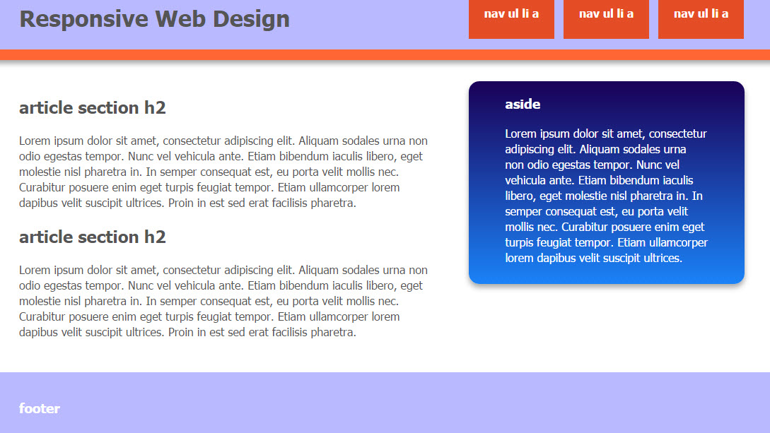
Design Layout dengan konsep Responsive Web Design, sudah sangat populer sejak tahun 2013 yang lalu. Bentuk ini memungkin layout dapat menyesuaikan bentuk tampilan web sesuai dengan ukuran layar device yang digunakan untuk mengakses tampilan. Hal ini sering terjadi pada penerapan aplikasi web yang dapat dibuka pada browser di desktop maupun di perangkat mobile.
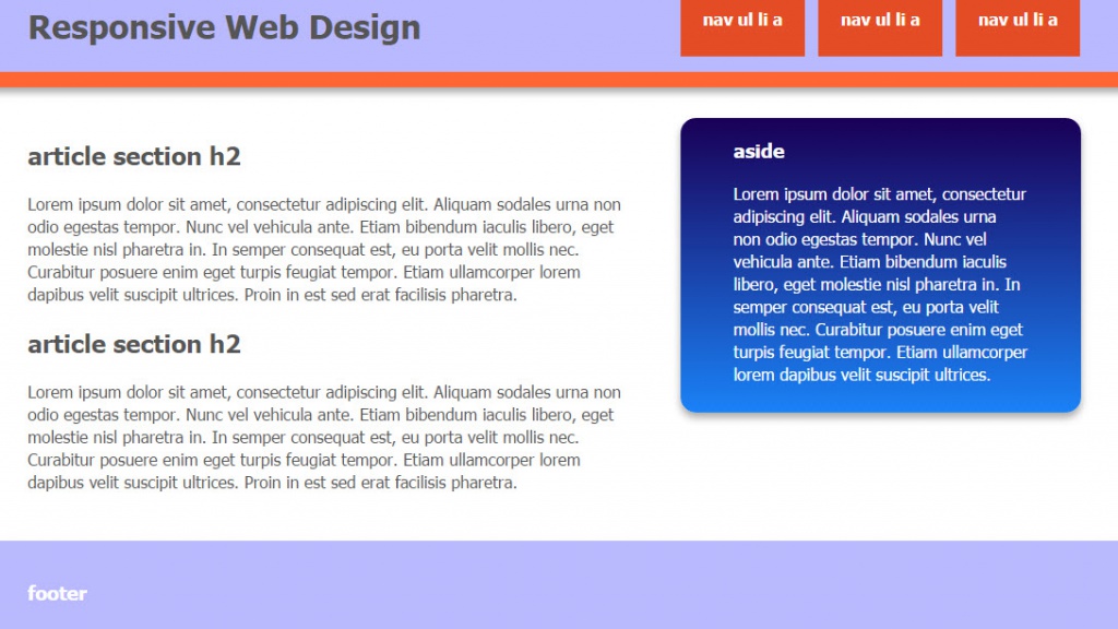
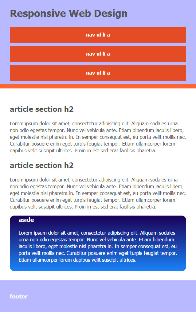
Dari contoh ilustrasi diatas, dapat Anda amati perubahan bentuk layout secara horizontal, yang salah satu tujuannya adalah memudahkan navigasi pengguna. Perubahan otomatis ini dapat kita terapkan dengan menggunakan teknik Responsive HTML5 dan CSS3.
Perhatikan code HTML5 berikut ini,
<html> <head> <title>Responsive HTML5 dan CSS3</title> <link rel="stylesheet" href="style.css" type="text/css" /> </head><body><div class="header-container"> <header class="wrapper clearfix"> <h1 class="title">Responsive Web Design</h1> <nav> <ul> <li><a href="#">nav ul li a</a></li> <li><a href="#">nav ul li a</a></li> <li><a href="#">nav ul li a</a></li> </ul> </nav> </header> </div> <div class="main-container"> <div class="main wrapper clearfix"> <article> <section> <h2>article section h2</h2> <p>Lorem ipsum dolor sit amet, consectetur adipiscing elit. Aliquam sodales urna non odio egestas tempor. Nunc vel vehicula ante. Etiam bibendum iaculis libero, eget molestie nisl pharetra in. In semper consequat est, eu porta velit mollis nec. Curabitur posuere enim eget turpis feugiat tempor. Etiam ullamcorper lorem dapibus velit suscipit ultrices. Proin in est sed erat facilisis pharetra.</p> </section> <section> <h2>article section h2</h2> <p>Lorem ipsum dolor sit amet, consectetur adipiscing elit. Aliquam sodales urna non odio egestas tempor. Nunc vel vehicula ante. Etiam bibendum iaculis libero, eget molestie nisl pharetra in. In semper consequat est, eu porta velit mollis nec. Curabitur posuere enim eget turpis feugiat tempor. Etiam ullamcorper lorem dapibus velit suscipit ultrices. Proin in est sed erat facilisis pharetra.</p> </section> </article><aside> <h3>aside</h3> <p>Lorem ipsum dolor sit amet, consectetur adipiscing elit. Aliquam sodales urna non odio egestas tempor. Nunc vel vehicula ante. Etiam bibendum iaculis libero, eget molestie nisl pharetra in. In semper consequat est, eu porta velit mollis nec. Curabitur posuere enim eget turpis feugiat tempor. Etiam ullamcorper lorem dapibus velit suscipit ultrices.</p> </aside></div> <!-- #main --> </div> <!-- #main-container --> <div class="footer-container"> <footer class="wrapper"> <h3>footer content</h3> </footer> </div> </body></html>
dan ini adalah modifikasi untuk code CSS3
body{
 font-family: "Tahoma";
 color:#555;
 font-size: 1em;
 line-height: 1.4;
 margin:0px;
}
.wrapper { width: 90%; margin: 0 5%; }.header-container, .footer-container{ background: #B9B9FF; }.main aside { background: #0055BB; background: -webkit-linear-gradient(top, #1A0057, #1A82F7); }.header-container { border-bottom: 15px solid #FF6633; }nav ul,ol { list-style:none; list-style-image:none; }aside{ border-radius:15px; -moz-border-radius:15px; }/* ============== MOBILE: Menu ============== */nav ul { margin: 0; padding: 0; }nav a { display: block; margin-bottom: 10px; padding: 15px 0;text-align: center; text-decoration: none; font-weight: bold;color: white; background: #e44d26; }nav a:hover, nav a:visited { color: white; }nav a:hover { text-decoration: underline; }/* ============== MOBILE: Main ============== */.main { padding: 30px 0; }.main article h1 { font-size: 2em; }.main aside { color: white; padding: 0px 5% 10px; }.footer-container footer { color: white; padding: 20px 0; } /* ===== END MOBILE ===== */@media only screen and (min-width: 680px) {/* ==================== INTERMEDIATE: Menu ==================== */nav a { float: left; width: 27%; margin: 0 1.7%; padding: 25px 2%; margin-bottom: 0; }nav li:first-child a { margin-left: 0; }nav li:last-child a { margin-right: 0; } } /* == END INTERMEDIATE == */@media only screen and (min-width: 880px) {/* ==================== WIDE: CSS3 Effects ==================== */.header-container, .main aside { -webkit-box-shadow: 0 5px 10px #aaa; -moz-box-shadow: 0 5px 10px #aaa; box-shadow: 0 5px 10px #aaa; }/* ============ WIDE: Menu ============ */.title { float: left; }nav { float: right; width: 38%; }/* ============ WIDE: Main ============ */.main article { float: left; width: 57%; }.main aside { float: right; width: 28%; } } /* == END WIDE == */@media only screen and (min-width: 1140px) {/* =============== Maximal Width =============== */.wrapper { width: 1026px; /* 1140px - 10% for margins */ margin: 0 auto; } }.clearfix:before, .clearfix:after { content: " "; display: table; }.clearfix:after { clear: both; }.clearfix { *zoom: 1; }
Selamat Mencoba!